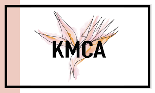
BW and Color Logos


These logos took around 2 hours to make overall. The KMCA in the center of the images stand for my name, Kylee Marie Carmela Andreoli. In the background of each of the logos are line drawing of my favorite flower, the bird of paradise. These flowers are primarily found in tropical weathers like in Hawaii (where I first saw them). They are also all around campus coincidentally. Not only are they beautiful but they also represent things I enjoy like nature, adventure, tropical feels and zen. The black and white logos, I initially just used there watercolor form and used shades of black and white but then I had to recreate another black and white with just those two colors so I just made a simple line drawing of black and white. The colors in each of the logos are used very intentionally. The first and second colored logos use more literal colors of the actual flower, the green represents nature, the blue represents the Ocean and Hawaii and the pink/orange color is used to represent beauty and warmth. The last logo is just orange and pink, I used these colors because I am very into beauty and I wanted choose colors to represent that. The pink is for luxurious, feminity, and beauty and the orange stands for friendliness and welcomeness.
Reference Picture:

Comments
Post a Comment